App · 2026
Vibepod
A mood-aware podcast app that matches content to how you feel, not just what you've listened to before.
Overview
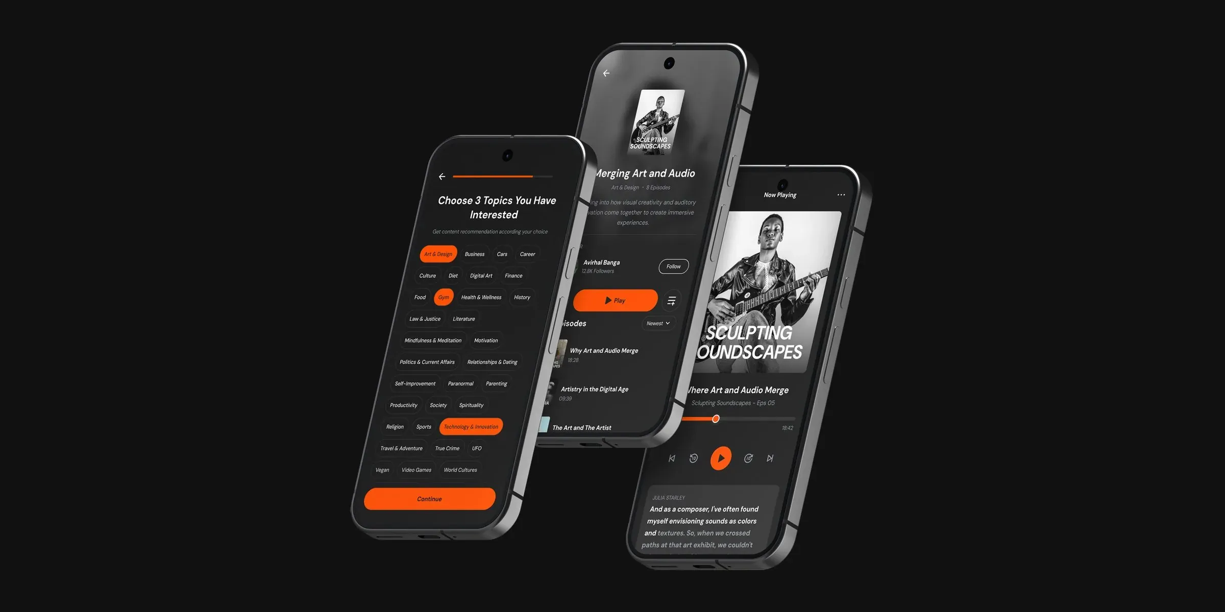
VibePod is a mood-aware podcast app that matches content to how you feel, not just what you’ve listened to before.
Designed for people who want their podcast experience to adapt to their day, VibePod moves beyond static recommendations to deliver the right content at the right emotional moment.
Problem
Existing apps like Spotify, Apple Music and Pocket Casts recommend content based on listening history and topic tags. They ignore mood, time of day, and situational context entirely.
A user winding down at 10pm doesn’t want the same suggestions as when they’re powering through a Monday morning commute.
User research
What listeners actually need, and what platforms ignore: the data behind the design decisions.
- of podcast listeners listen while relaxing before sleep, so content needs to vary by time of day
- 51%
- of listeners use more than one podcast app a month (approx.): no single platform meets every need
- 47%
- of new podcast discoveries come from platform algorithms or search (approx.), so recommendation quality is critical
- 42%
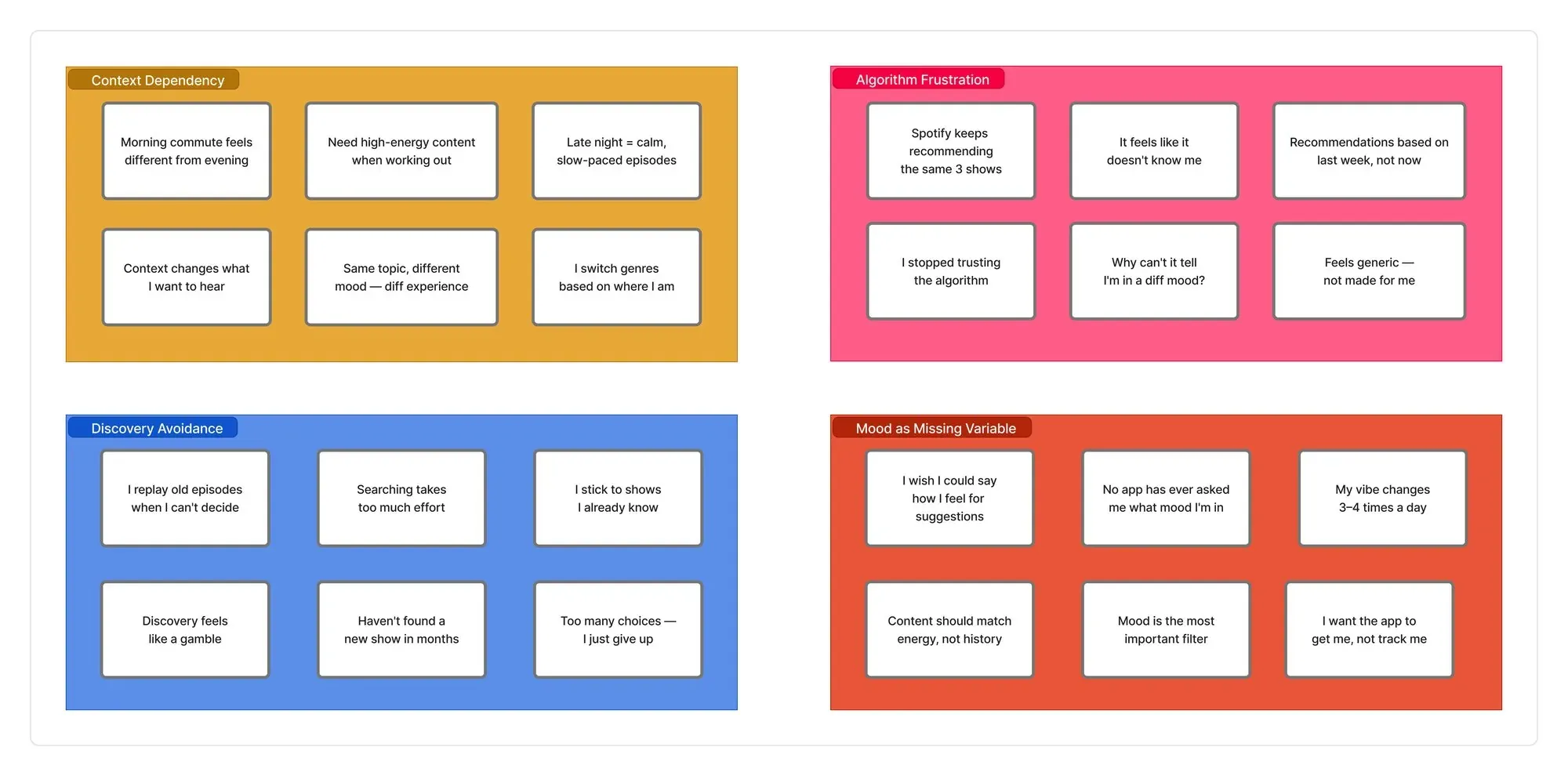
Affinity diagram
Interview notes clustered into four themes: context dependency, algorithm frustration, discovery avoidance, and mood as the missing variable.
User personas
Avirhal Banga, 26
A freelance chartered accountant multiplying people’s wealth.
Avirhal has no fixed schedule. His day flows between deep work, breaks and late-night sessions. He listens to podcasts constantly, but in very different ways depending on what he’s doing. When he’s designing, he wants background noise with substance; when he’s burnt out, he wants something that pulls him in emotionally. He’s open to discovering new shows but finds the effort of searching exhausting.
Goals: find content that matches his current energy without searching; discover new shows in niches like Art & Design and Mindfulness; keep up with live creative conversations and events.
Frustrations: recommendations feel generic and repetitive; it’s hard to switch contexts between focused work and casual listening; there’s no way to signal “I want something calm right now”.

Sofia, 31
Secondary school teacher.
Sofia’s day is rigidly structured: up at 6am, prep, teach, gym, cook, sleep. Podcasts fit into very specific slots: educational content during her morning routine, light comedy or storytelling on her commute home, and absolutely nothing stimulating after 9pm. She’s not looking to discover new genres; she knows exactly what she wants at each point in the day. The problem is no app organises content around her schedule.
Goals: time-aware recommendations without any manual setup; quick access to familiar categories for each part of her day; no more five minutes spent deciding what to play.
Frustrations: she has to seek out different content types manually throughout the day; recommendation engines ignore the fact that it’s 8pm and she’s exhausted; she feels like she’s managing the app rather than the app serving her.

Competitor analysis
| Feature | Spotify | Apple Music | Pocket Casts | Vibepod |
|---|---|---|---|---|
| Mood-based recommendations | ✗ | ✗ | ✗ | ✓ |
| Live podcast sessions | ✗ | ✗ | ✗ | ✓ |
| Topic onboarding | Partial | ✗ | ✗ | ✓ |
| Time-of-day context | ✗ | ✗ | ✗ | ✓ |
| Episode transcripts | ✓ | ✗ | ✗ | ✓ |
| Personalised home feed | ✓ | Partial | ✗ | ✓ |
Design process
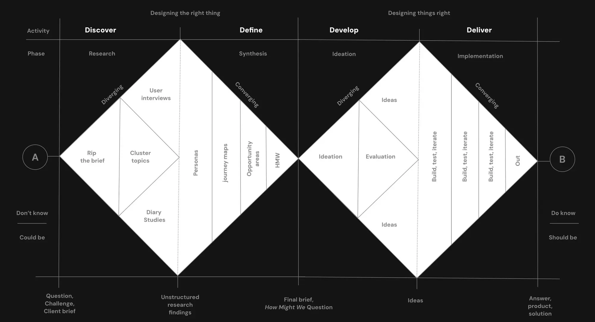
The process followed a double diamond: discover, define, develop, deliver.
- 01Discover
User interviews and diary studies to map emotional states across a typical day.
- 02Define
Synthesised research into personas, journey maps and a clear problem statement.
- 03Develop
Sketched flows, built low- and mid-fidelity wireframes, iterated on feedback.
- 04Deliver
High-fidelity UI, a design system, and a prototype for usability testing.
User flow
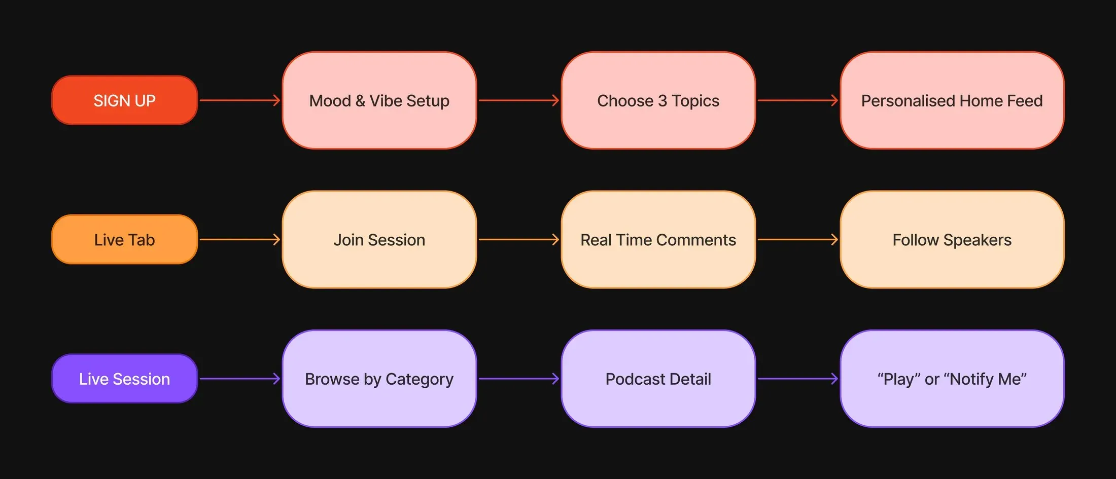
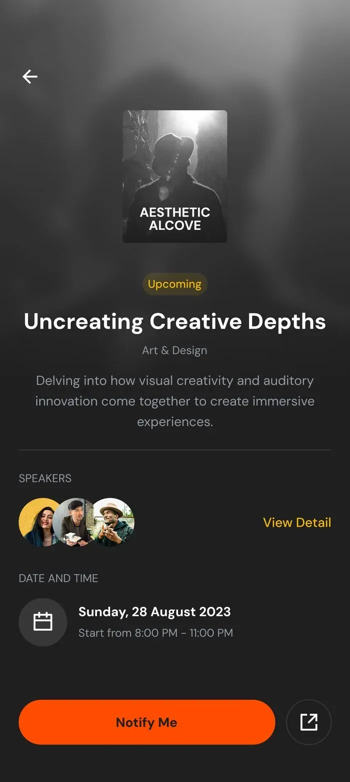
Mapping the three core journeys through the app: sign up → choose 3 topics → mood & vibe setup → personalised home feed; live tab → join a session → real-time comments → follow speakers; live session → browse by category → podcast detail → play or “notify me”.
Wireframes
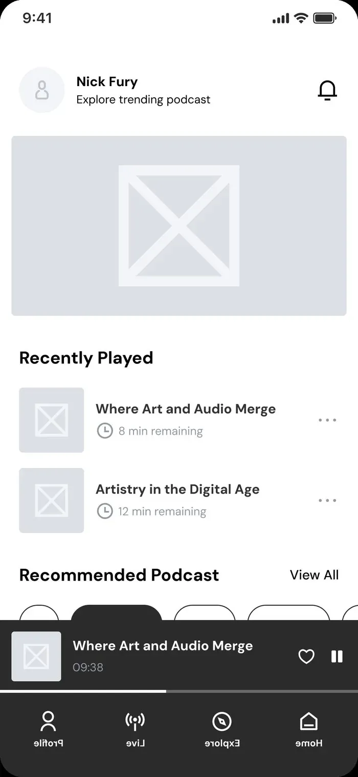
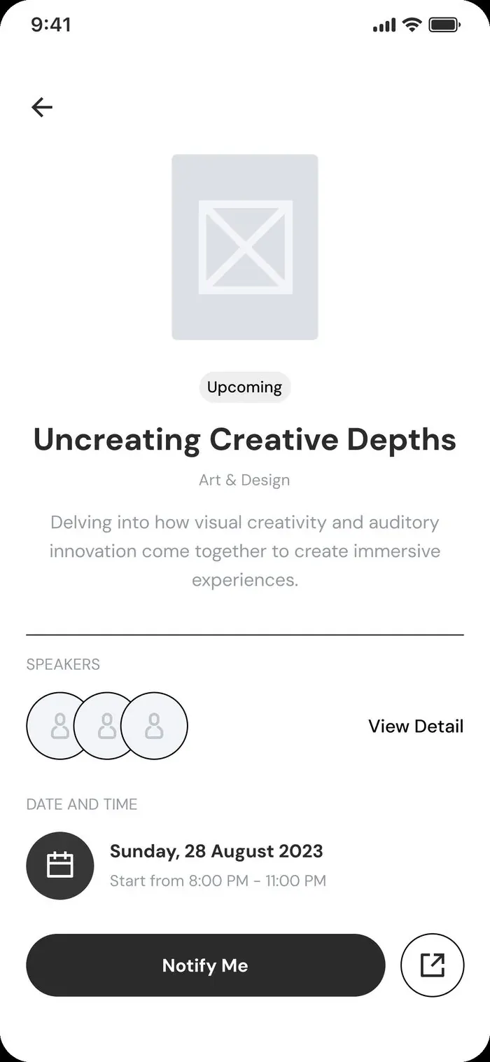
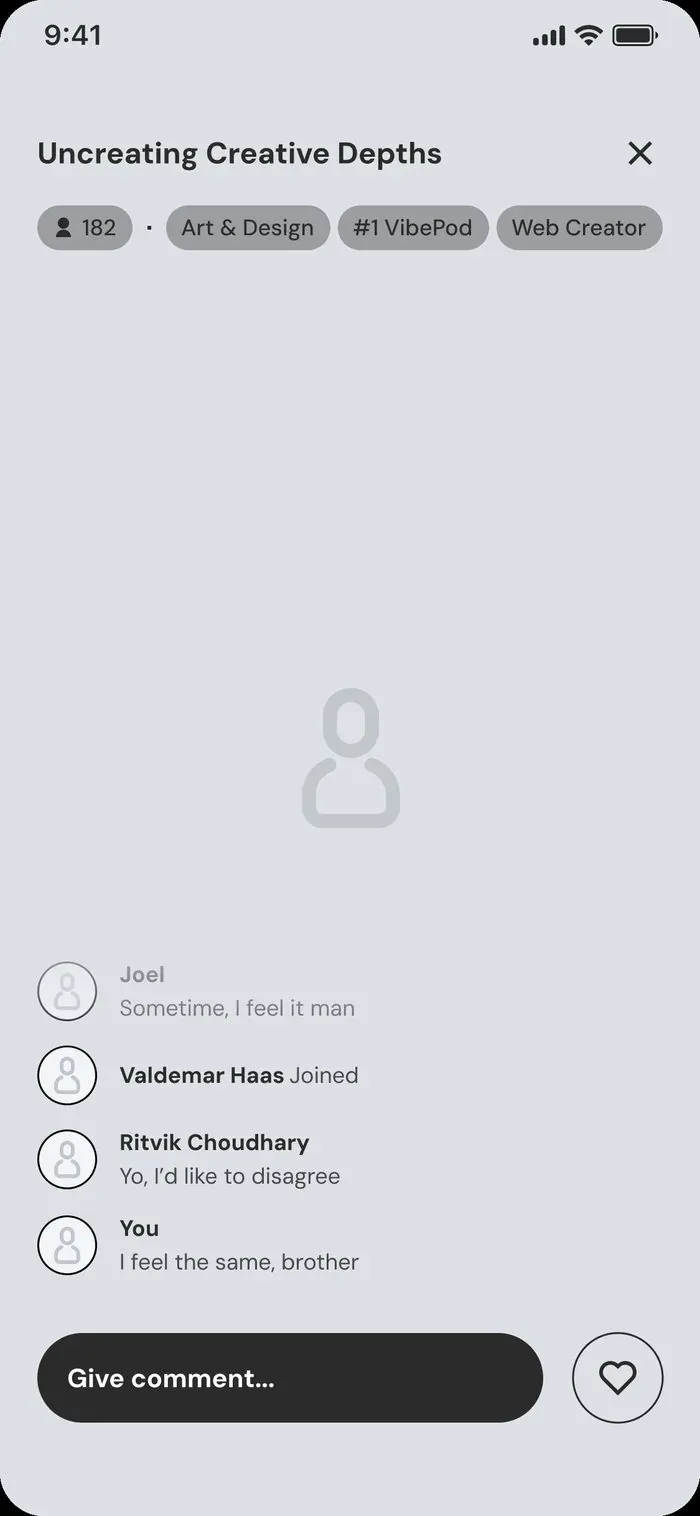
From rough sketches to refined structure.
Key design decisions
The reasoning behind every intentional choice.
1. Question-driven vibe setup
Instead of asking users to configure settings, the app has a conversation with them. Four simple questions replace what could have been a complex preference panel.
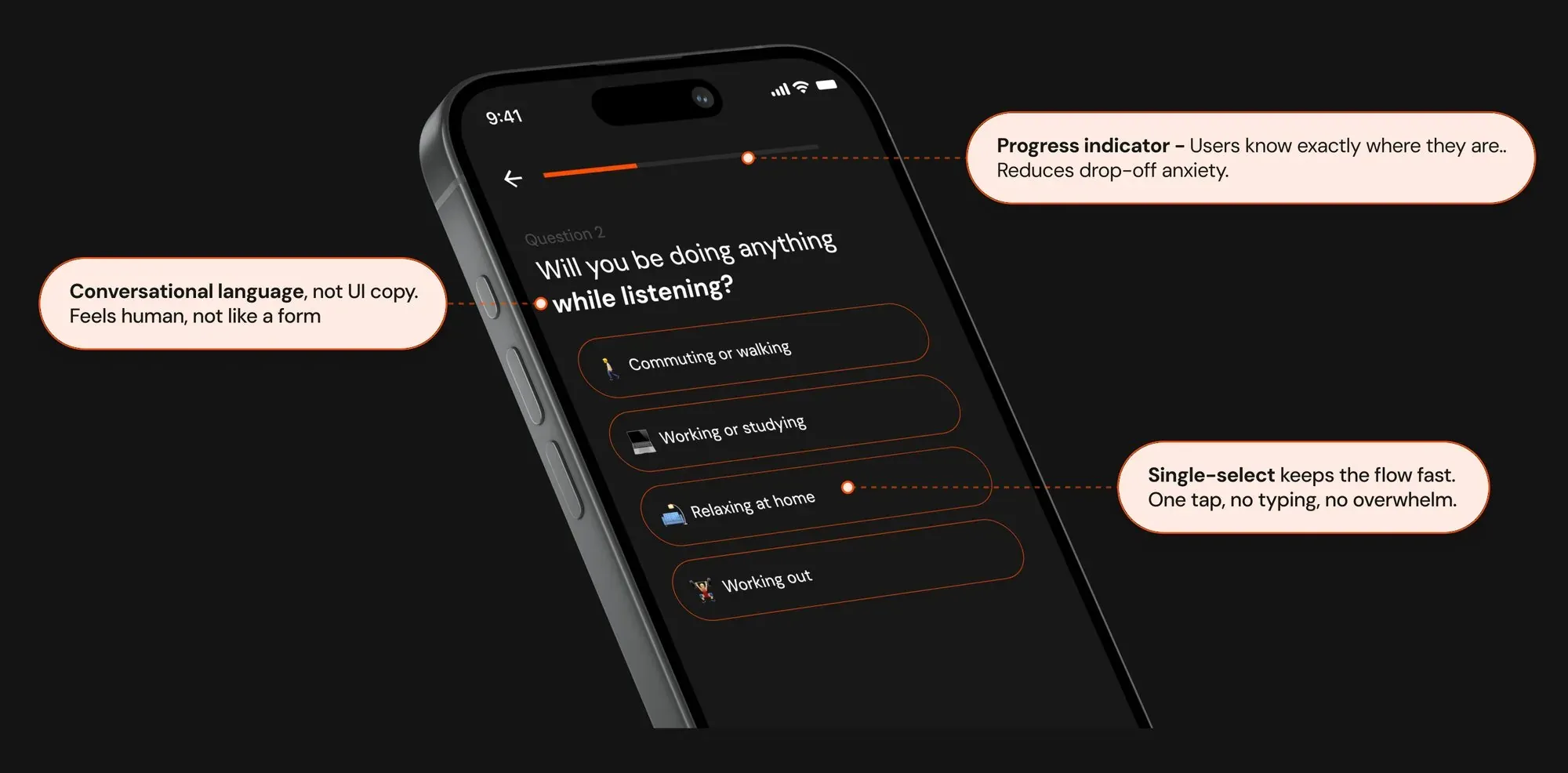
- Progress indicator: users know exactly where they are, which reduces drop-off anxiety.
- Conversational language, not UI copy: it feels human, not like a form.
- Single-select keeps the flow fast: one tap, no typing, no overwhelm.
2. Vibe reveal and spider graph
The spider graph isn’t user-configured; it’s revealed as a result. This reframes the experience from “set your preferences” to “see yourself reflected”, a fundamentally more emotional and trustworthy moment.
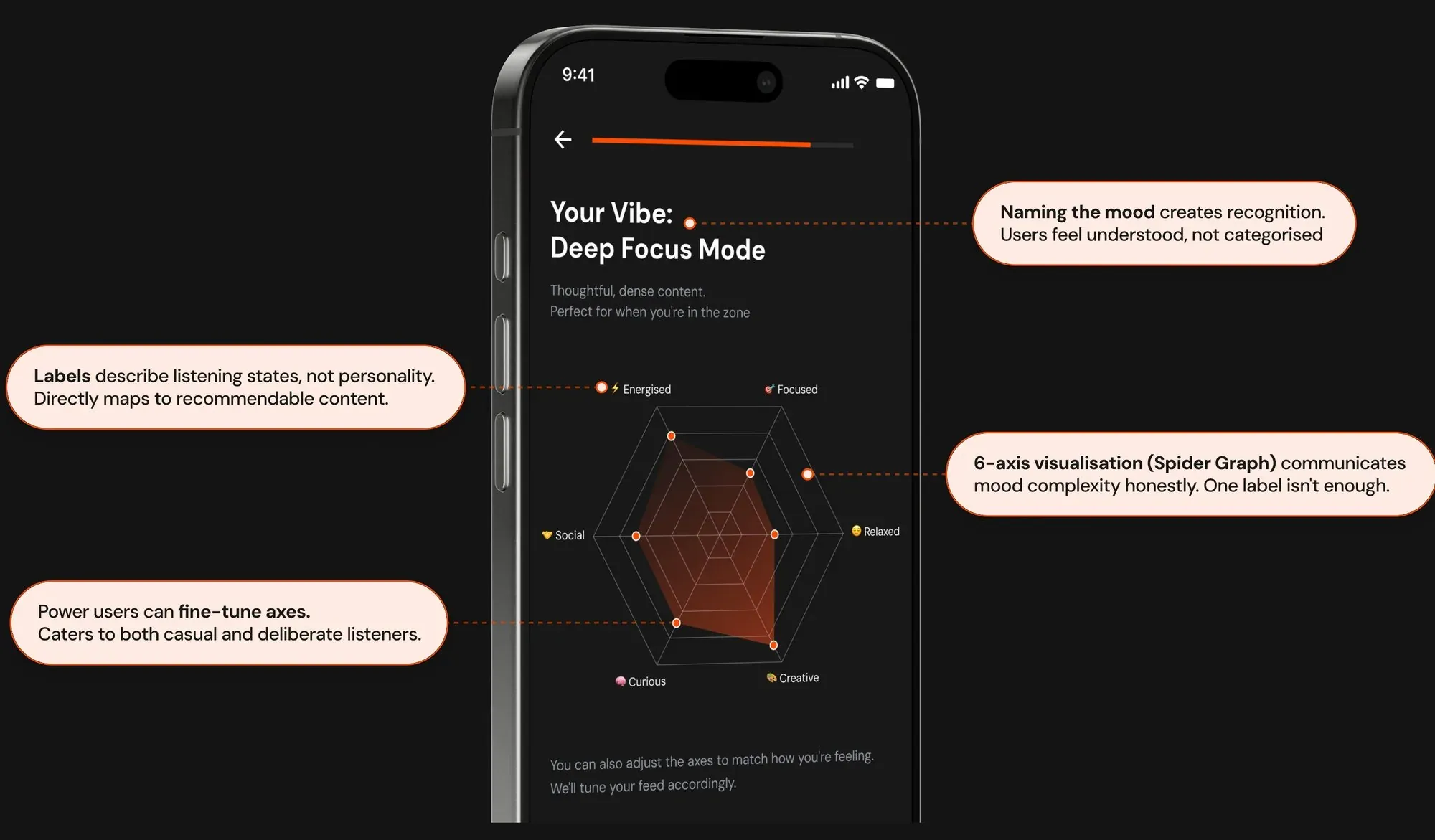
- Naming the mood creates recognition: users feel understood, not categorised.
- Labels describe listening states, not personality, so they map directly to recommendable content.
- A six-axis visualisation communicates mood complexity honestly. One label isn’t enough.
- Power users can fine-tune the axes, catering to both casual and deliberate listeners.
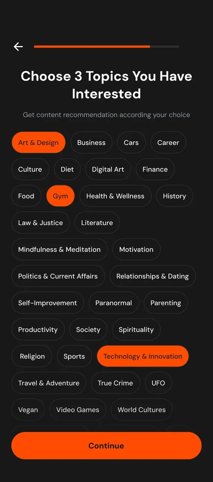
3. Vibe-filtered topic selection
Topics aren’t shown as a flat list; they’re pre-filtered based on the detected vibe. A “Wind Down” vibe hides True Crime; a “Deep Focus” vibe surfaces Philosophy and Science. The two layers, mood and topic, work together rather than independently.
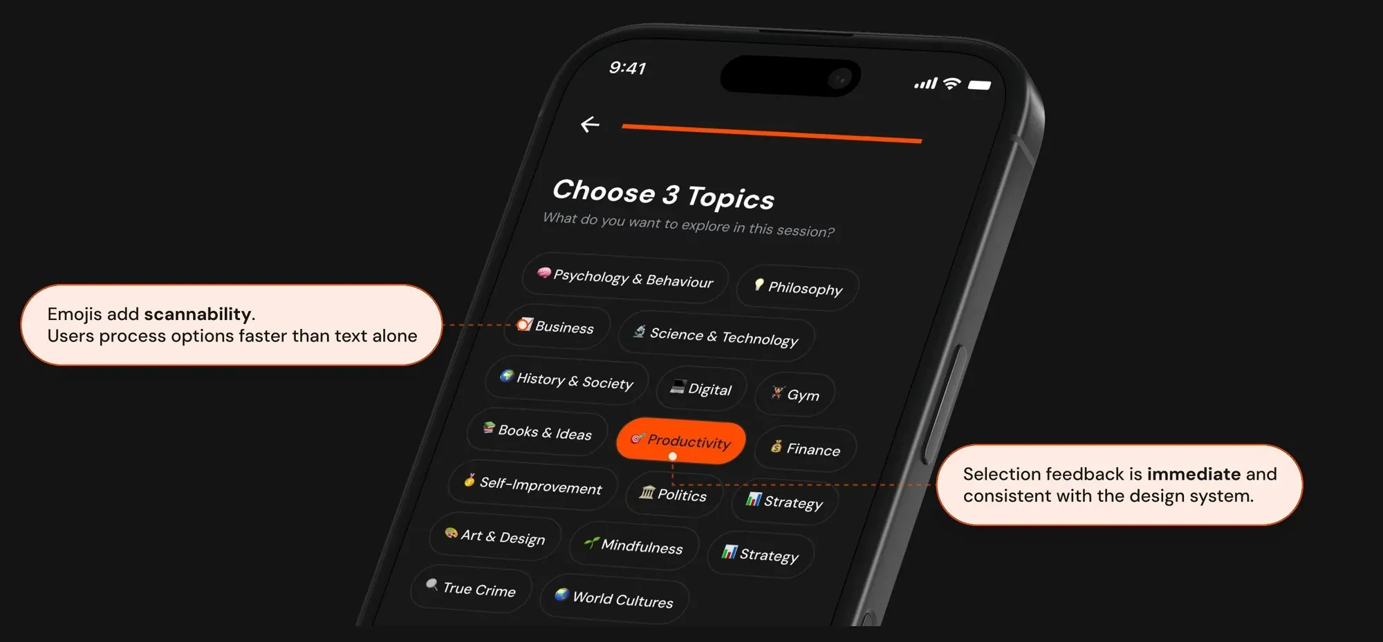
- Emojis add scannability: users process options faster than with text alone.
- Selection feedback is immediate and consistent with the design system.
4. Save vibe as a profile
A one-time mood input becomes a reusable profile. Users who commute every morning or deep-work every afternoon shouldn’t have to answer four questions every time. Saved profiles make the system smarter with use.
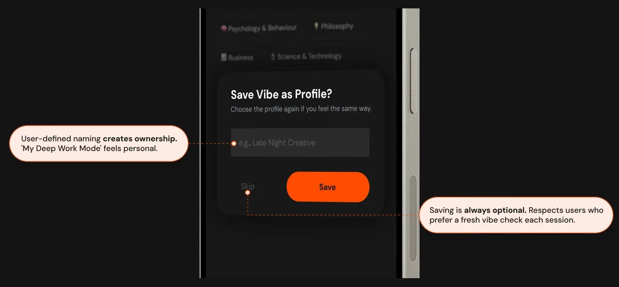
- User-defined naming creates ownership: “My Deep Work Mode” feels personal.
- Saving is always optional, respecting users who prefer a fresh vibe check each session.
5. Live sessions as a social layer
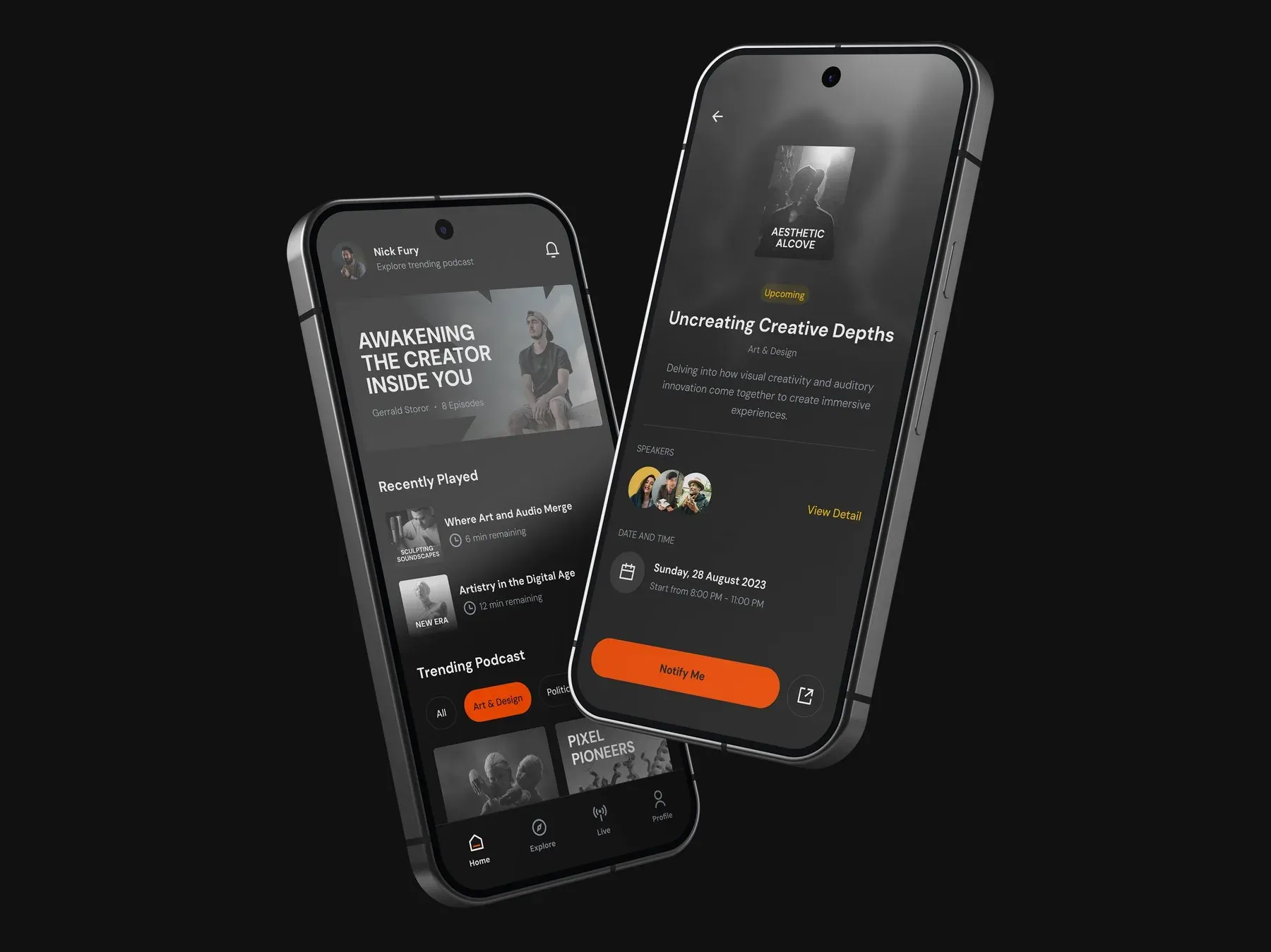
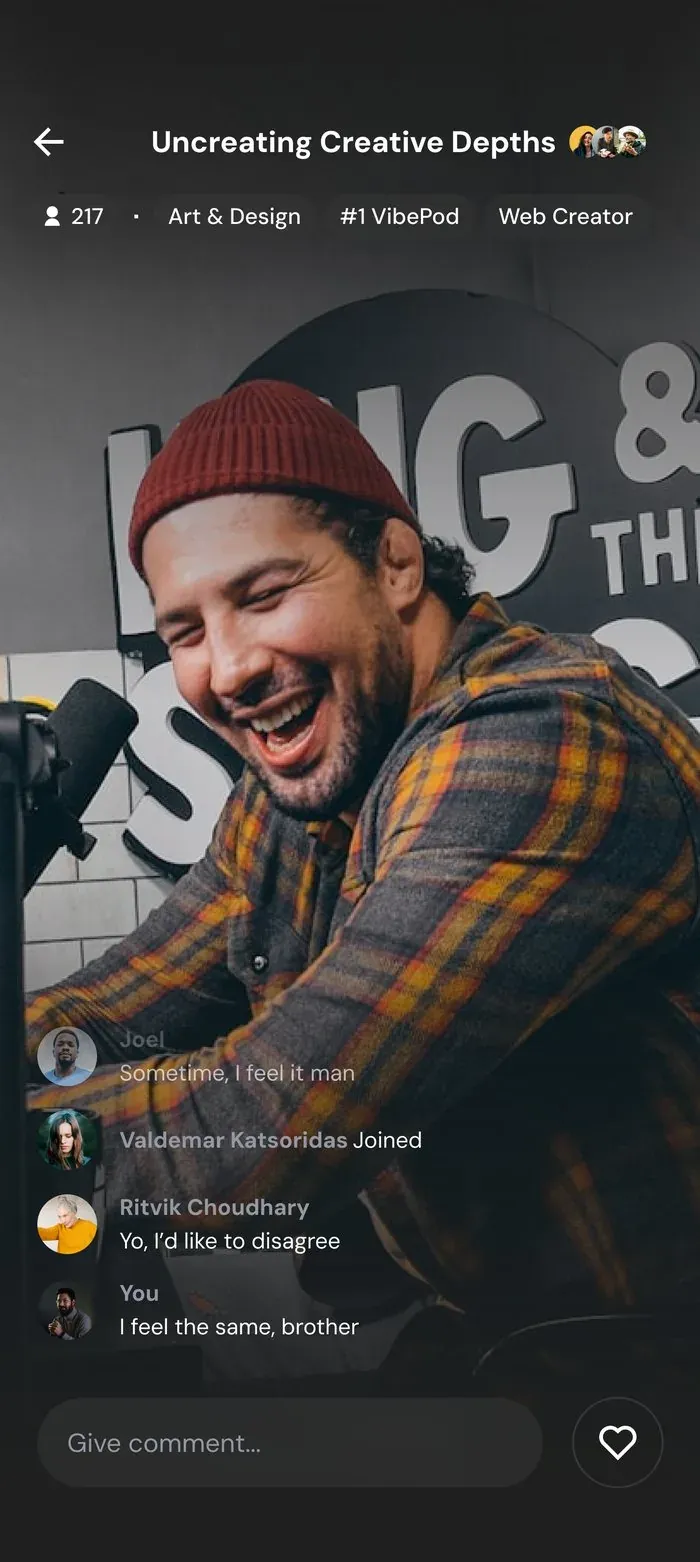
Every other podcast app is a solitary experience. Vibepod’s Live tab adds a real-time communal layer where listeners become participants. The comment stream and viewer count serve the shift from consumption to community.
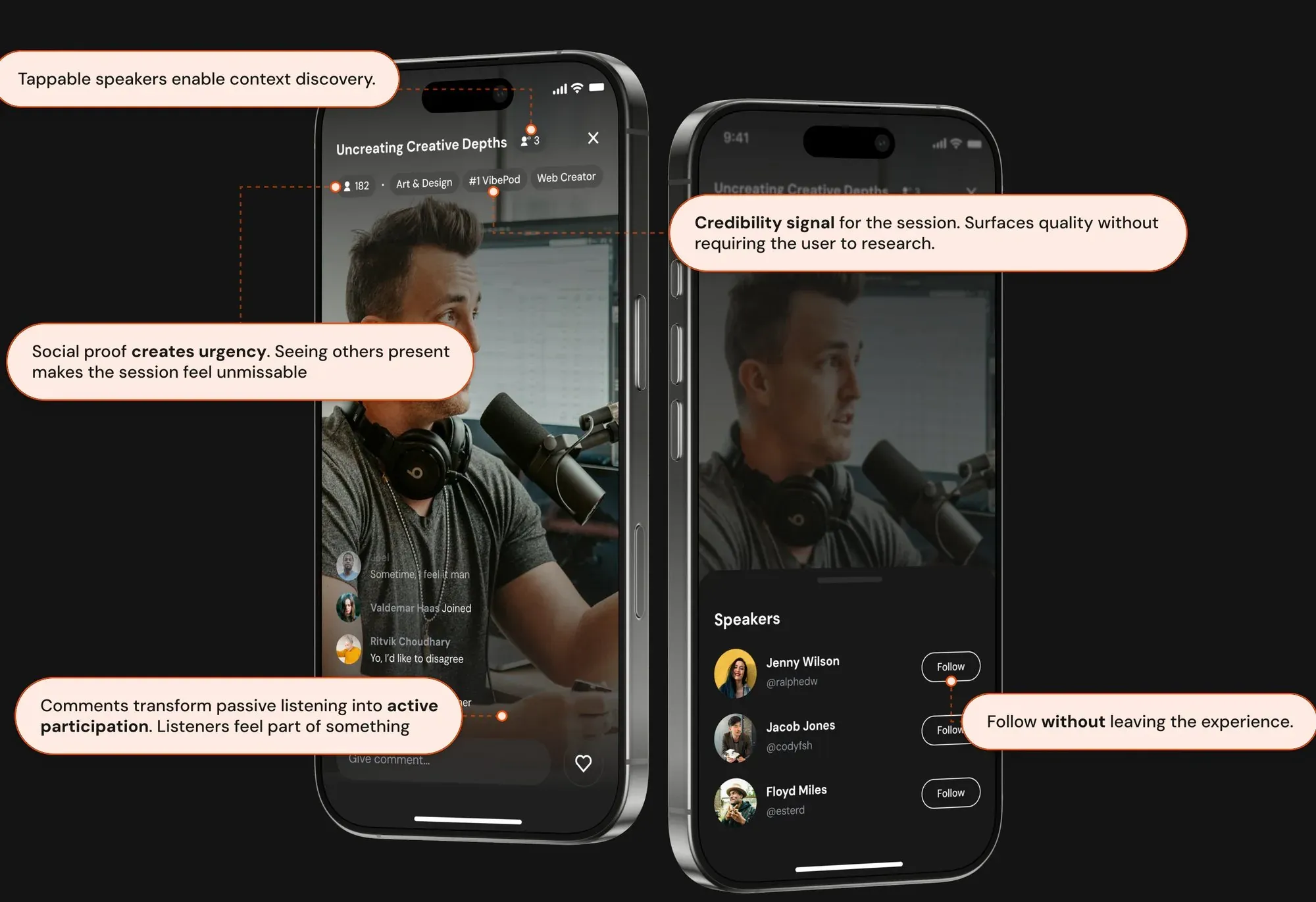
- Tappable speakers enable context discovery.
- A credibility signal for the session surfaces quality without the user having to research.
- Social proof creates urgency: seeing others present makes the session feel unmissable.
- Comments turn passive listening into active participation.
- Follow without leaving the experience.
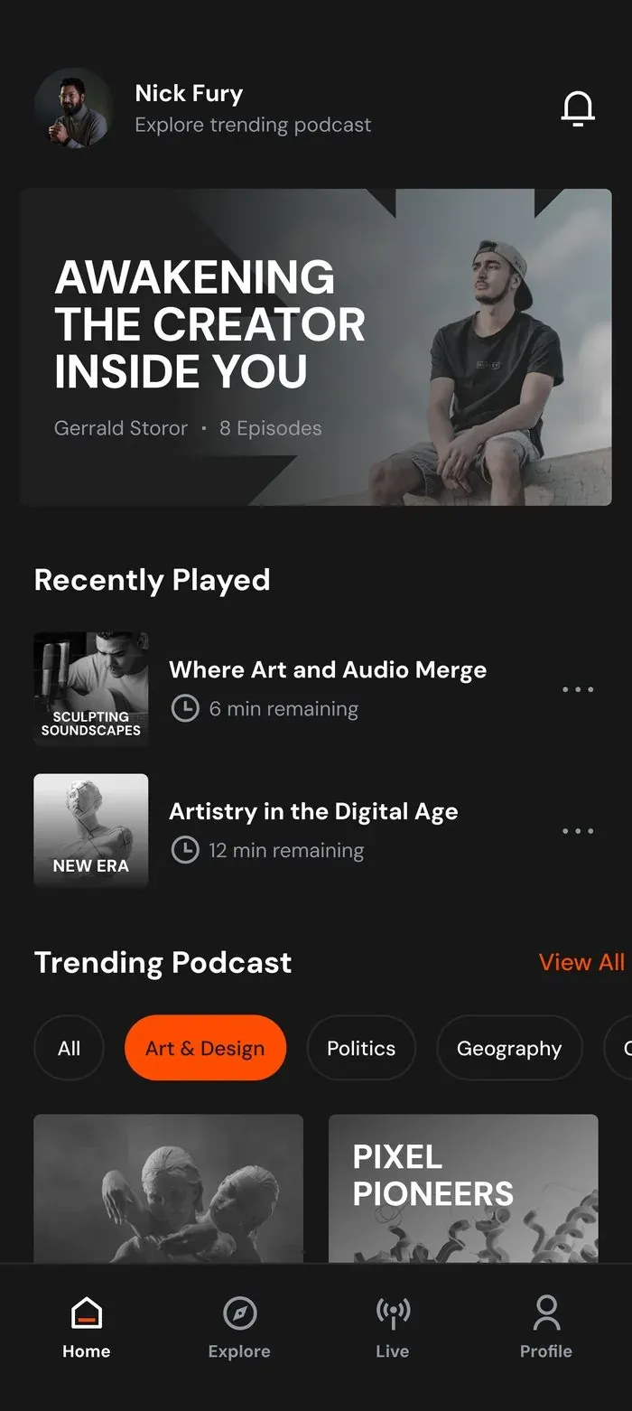
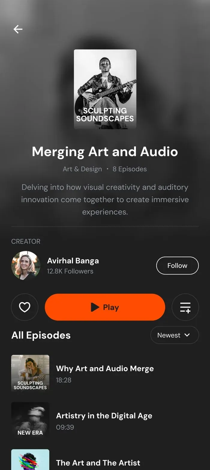
Final screens
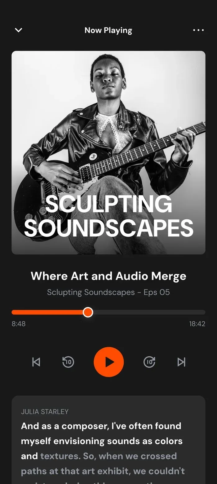
Where research, logic and design come together.
Reflection and next steps
What the design addressed
| Problem identified in research | Design response |
|---|---|
| Algorithms ignore mood and context | A four-question vibe check derives a personalised mood profile |
| Discovery feels like too much effort | Vibe-filtered topic selection narrows choices before the user sees them |
| Listening is solitary and passive | Live sessions add a real-time community layer |
| Returning users repeat the same setup | Saved vibe profiles enable one-tap personalisation |
What I’d measure if it shipped today
- Time to first play: does the vibe check reduce browsing time?
- Vibe check completion rate: do users drop off mid-flow?
- Live session participation rate: do listeners comment or just watch?
- Saved vibe profile adoption: do users return to saved profiles or redo the check?
- 7-day retention: does mood-aware content make users come back?
Next iterations I’d explore
- 01Passive vibe detection
Use time of day, listening history and activity patterns to suggest a vibe automatically, reducing friction to zero.
- 02Vibe profile sharing
Let users share named vibe profiles with friends ("here's my Deep Work Mode playlist"), turning a personal feature into a social one.
- 03Mid-session vibe shift
If a user skips three episodes in a row, prompt a vibe check: the app recognises the mood has changed and adapts in real time.